Team
Shared Roles: UX Design, UX Research, UX Design, UX Analyst
Problem
The team observed that people who work in or commute to DC for professional reasons have shown frustration with the inconveniences and costs of parking. This is intrusive and interrupts their daily routines. Since they are busy and work under tight deadlines and time constraints, they need a streamlined solution that allows them to continue their routines with minimal effort and time.
Value Proposition
For users commuting and traveling in the DMV area, our app will improve existing parking apps by providing information and innovative features that will improve users’ parking experience. We will target the improvement of notifications and information delivery to increase the efficiency of locating parking spots and decrease user pains and frustrations.
Objectives
- To help users avoid parking tickets
- To improve the convenience of parking in the DC metro area
- To help users reduce the cost of parking
- To improve and streamline features of current parking apps
Empathy Map
Target Persona
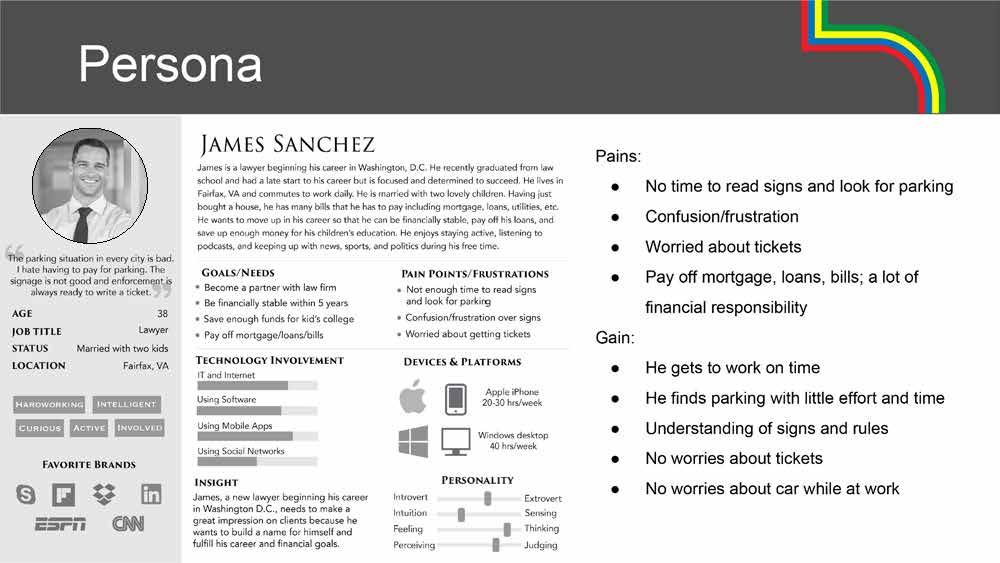
James Sanchez is a lawyer beginning his career in Washington DC. He commutes to DC frequently and finds that street parking is inconvenient and confusing. He uses a parking app, but he is not completely satisfied with its features.
Project Scope
The scope of this project involved qualitative research for a concept parking app. Qualitative research was done involving user interviews, observations, competitive analysis, and usability testing.
Insights were made and a user scenario, empathy map, persona, and storyboard were developed. A flow diagram, paper prototypes and wireframes were created. A final clickable prototype was created using the paper wireframes. Three iterations were of the prototypes were completed after according to user testing results. Conclusions were made as well as recommendations for future developments.
My Contribution
Contributions to the team in each of the roles of UX Design, UX Research, UX Design and UX Analyst, included:
- Participated in research, testing and analysis.
- Created a competitive analysis spreadsheet.
- Created low-fidelity wireframes.
- Create a low-fidelity prototype.
- Created empathy map.
- Conducted user interviews and documented results.
- Analyzed interview results, made insights.
- Conducted user testing of prototype.
- Analyzed results and made insights.
- Iterated on prototype based on user testing.
Research
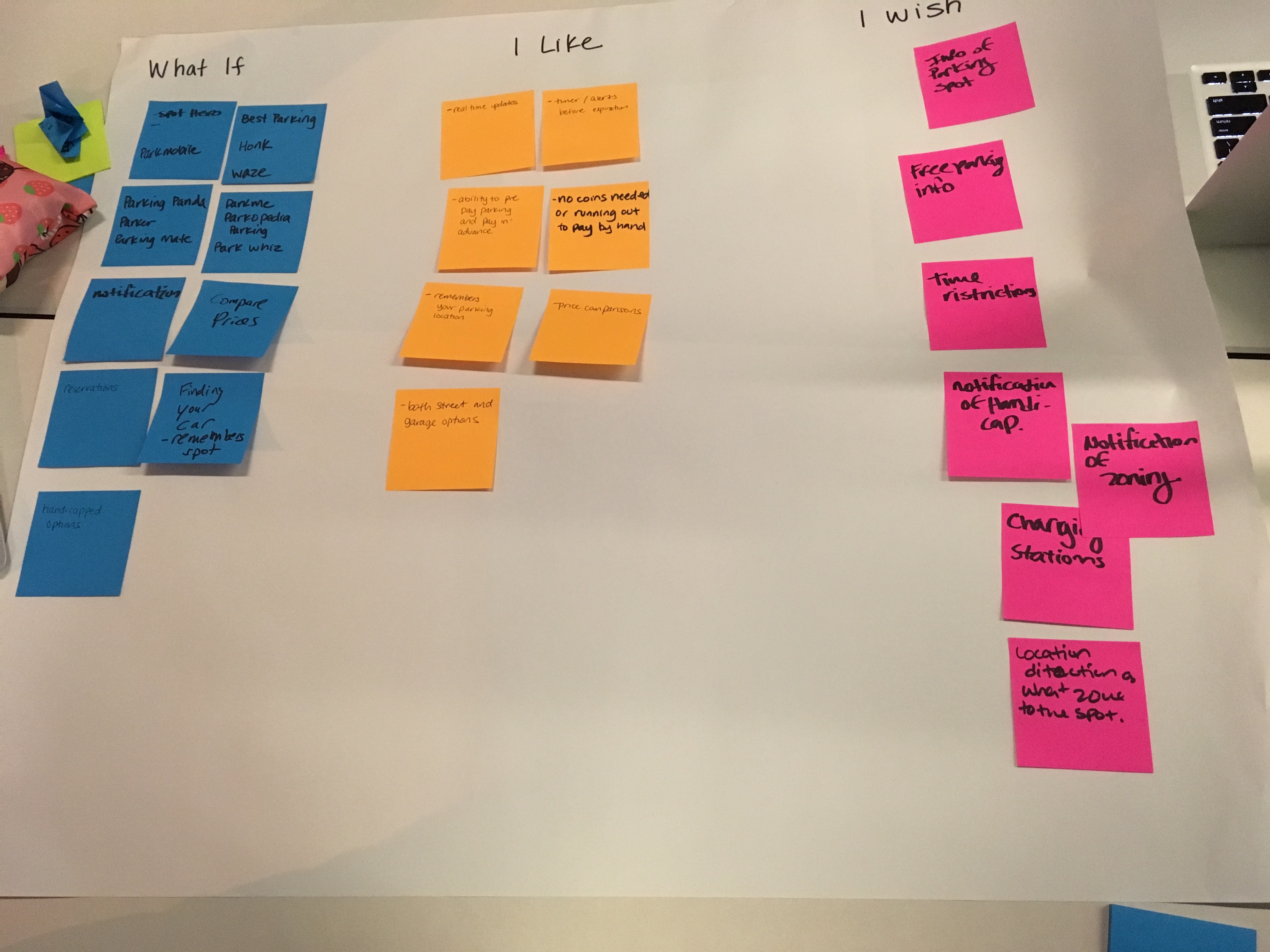
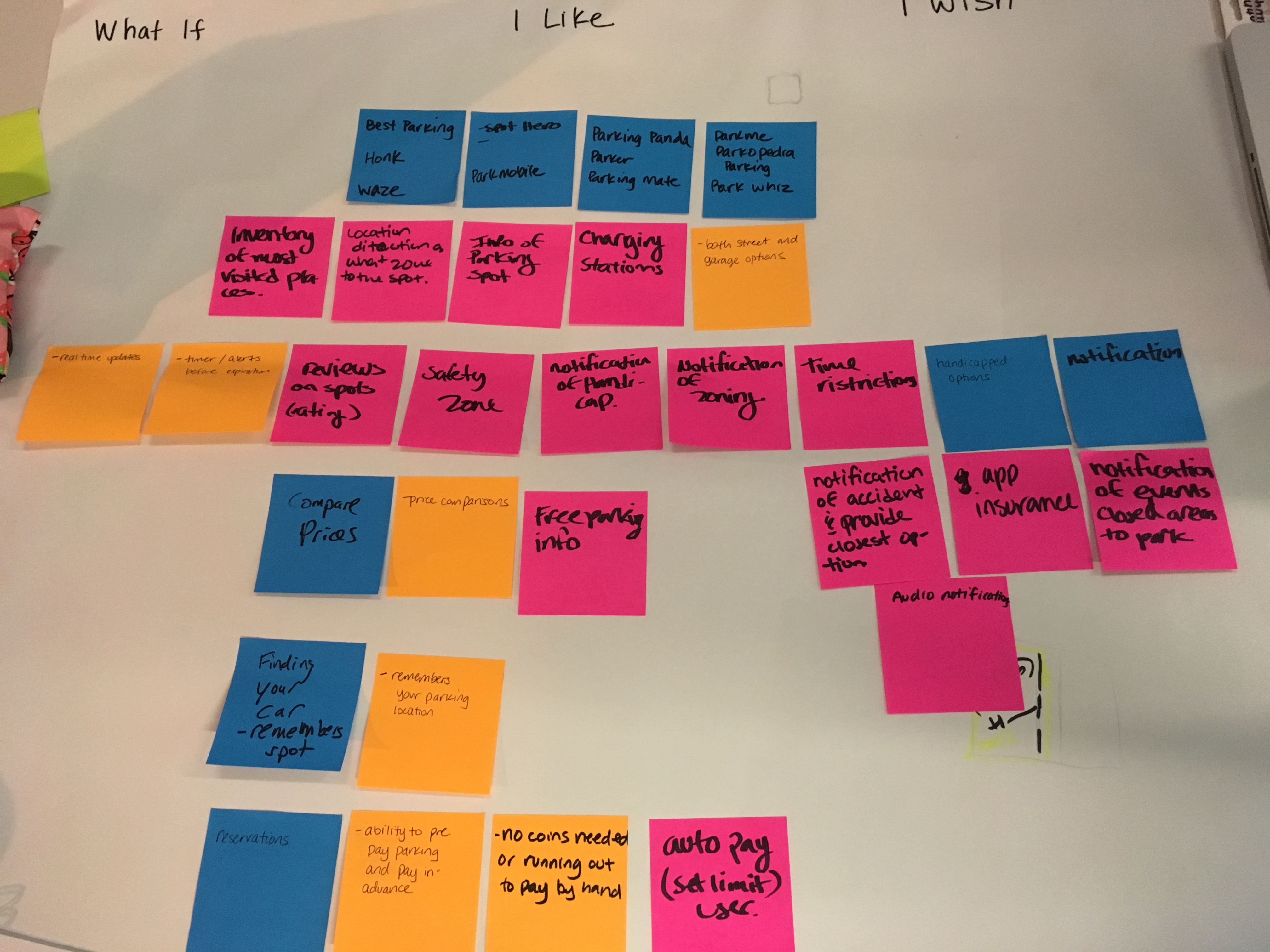
Team Ideation/Brainstorming
Qualitative Research
Interview and Observation Insights
- Users want to save time and money.
- Users want to avoid tickets.
- Users are confused by the parking signs
- Users hate to search for parking spots in DC.
- Users have received tickets despite using a parking app,.
- Users have experienced that notifications do not always work.
- Users have added payment before time expiration and still got a ticket.
- Users are happy with apps but still want more features
Quantitative Research
Competitive Analysis Insights
- Some parking apps are only for garage parking.
- The pay feature is very popular.
- Reservations features are limited to garage parking.
- Guaranteed reservation parking is not always coordinated with garage.
- A very desirable feature is a timer/expiration notification.
- A price comparison feature is popular.
- Users like the “find my car” feature of a parking app.
- Some parking apps have many categories of parking locations.
User Testing
Scenario
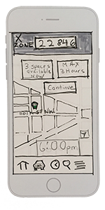
- User is driving from Fairfax VA to 1101 K St NW.
- He enters destination for street parking, zone/address when in VA.
- The app gives him choice of closest zone with the most available spots.
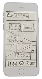
- As he drives, he gets real time updates of how many spots remain in zone.
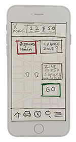
- When one spot remains, he gets a warning/notification.
- When 0 spots remain, he is notified that he will be switched to zone X with
X spots available. - He continues to the new zone.
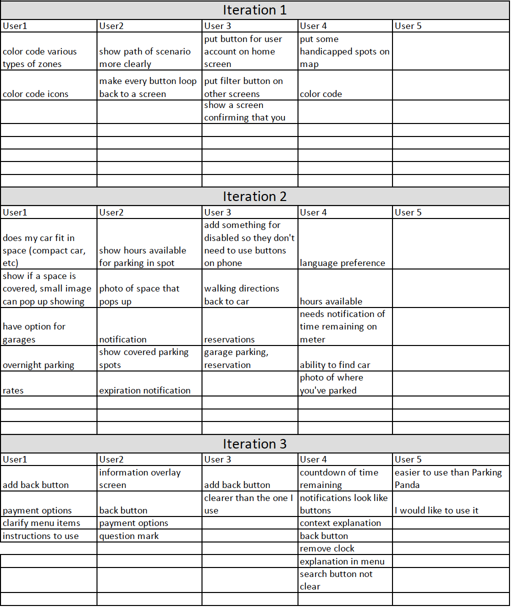
Results of Testing
Low-Fidelity Wireframes
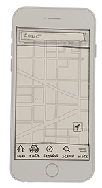
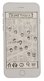
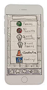

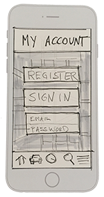

Final Deliverables
Low-Fidelity Prototype
https://invis.io/H4GSF40UDNC#/290474802_Home
Report
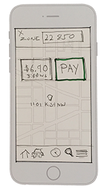
A UX report outlining the team’s process and a low fidelity prototype were the final deliverables. The proposed solution addressed many of the pain points and frustrations of users who park in the DC metro area. The prototype solved some problems that users experienced with current apps, such as getting tickets despite using the app, poor notifications and confusion with parking signs and searching for parking spots.
Results
Proposed solutions were clear notifications of expiring meters, and integrated functionality through a database with local government departments where a user is able to view available street parking spots, API integrated GPS and real time updates of available spots. This eliminates user errors made by confusing signs and available parking times. It also allows the users to see available spots in an area of their destination. Although reservations cannot be made for street parking, the proposed functionality will have the ability to see available spots with real time updates and warnings when spots in a destination are no longer available. The user will then have the ability to reroute to the closest area where more spots are available. This not only saves time, money but it eliminates errors and the frustrations of parking in an urban area.
The team proposed some ideas for future development which include
- accessible areas for those with disabilities
- reserved parking
- garage parking
- guidance to help the user find their car
- the ability to find spaces designated for compact cars, EV vehicles and covered parking
- features for those with disabilities and the addition of language preferences.

