Team
UX Lead, UX Design, UX Research Lead, UX Design Lead, UX Analyst Lead My Role UX Analyst
Problem
The team identified two major problems which were in global navigation, capturing the mission of the NPO and increasing visibility of essential features. The following objectives were identified.
Objectives
- Improve global navigation
- Capture the mission of TIMB throughout the site
- Increase visibility of the blog series
- Improve consistency of typography and visuals
- Increase visibility of the donation feature
Target Personas
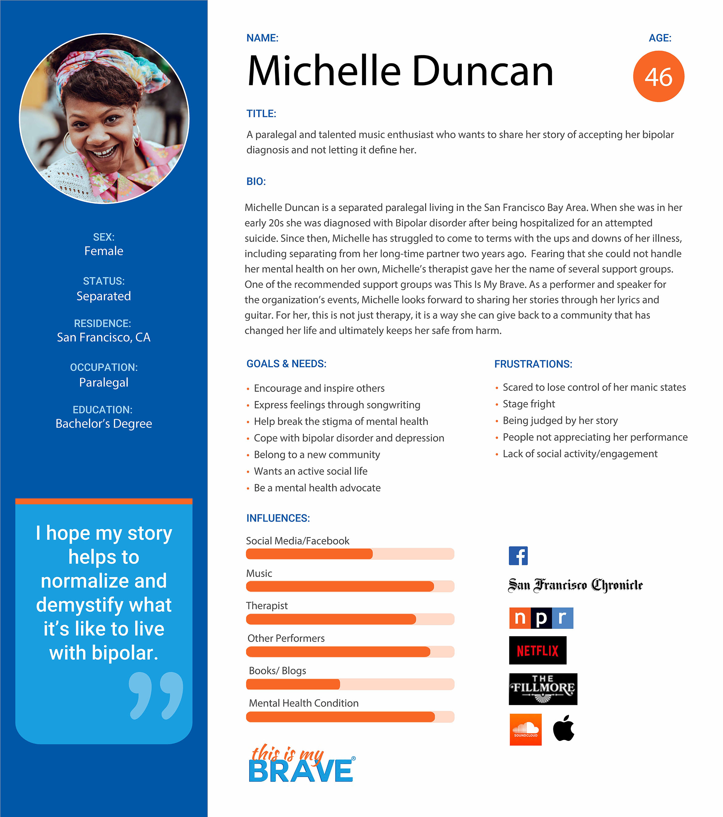
Lisa Williamson is a therapist, user of the site who wants to support the mission of the NPO. Her reasons for using the site would be to donate and attend events.
Michelle Duncan is a paralegal and talented music enthusiast who wants to share her story of mental illness. Her reason for using the site and would be to audition for shows.
Project Scope
The scope of the project involved making recommendations and web design prototypes to improve the user experience of the TIMB website. Recommendations were based on qualitative and quantitative research involving stakeholder interviews, social media and website data analysis, card sorting, information architecture and usability testing. Personas were developed and journey maps were completed to identify opportunities.
A site map was created which clarified global navigation. Low and high-fidelity prototypes were tested, with iterations.
My Contribution
My role on the team was UX Analyst Lead. Created research & analysis document. Interpreted and summarized Google Analytics reports. Participated in team card sorting and conducted user card sorting. Layout of Lisa Williamson persona. Built and designed site map. Built low-and high- fidelity prototypes, tested and iterated.
UX Research
- Qualitative
- Interviews with TIMB staff
- Survey of users
- Social Media analysis
- Website Analysis
- Qualitative
- Google Analytics
- Usability Testing
- Card Sorting
- Persona Development
- Journey Map Development
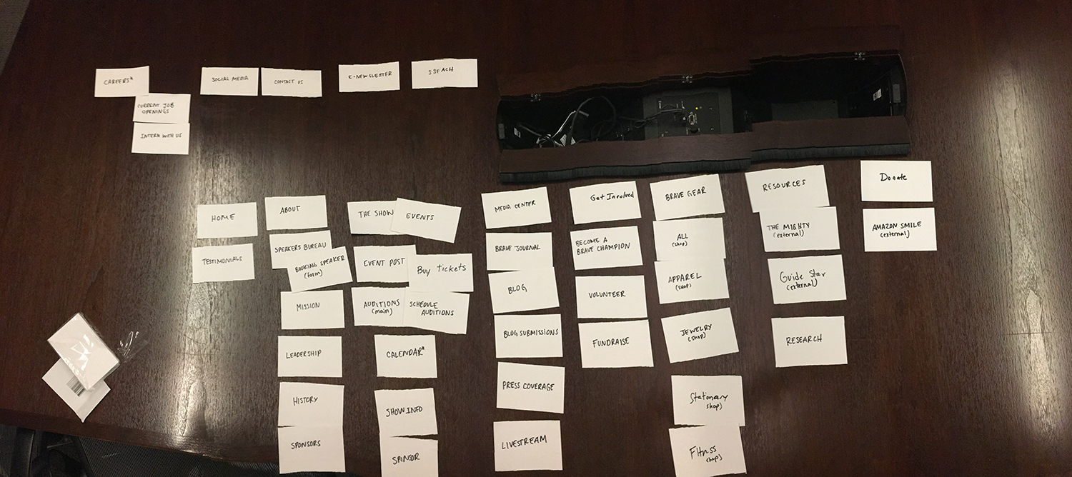
Team Card Sorting
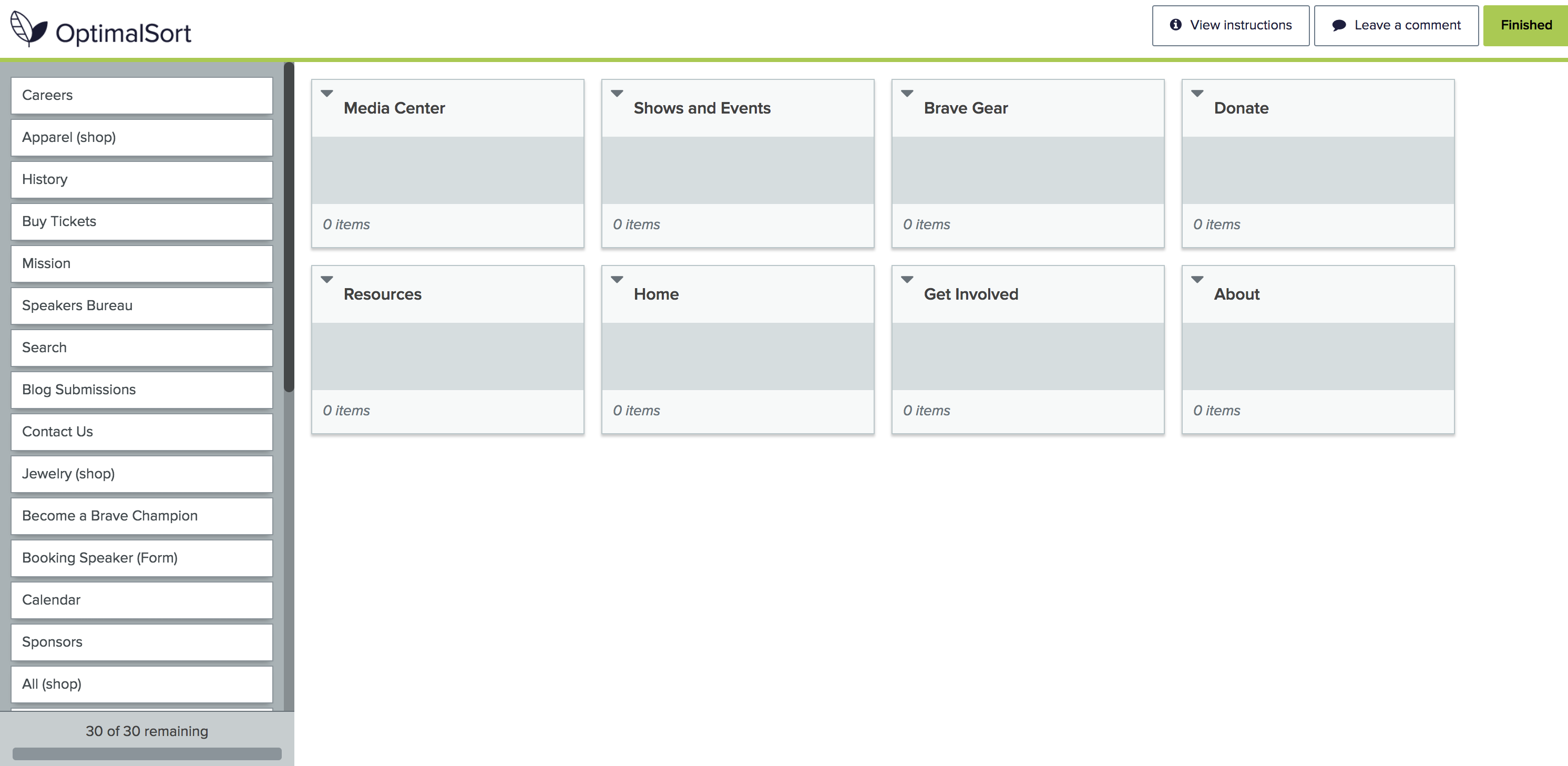
User Card Sorting
High and Low-Fidelity prototypes—Desktop
High Fidelity Wireframes
Mobile Tablet
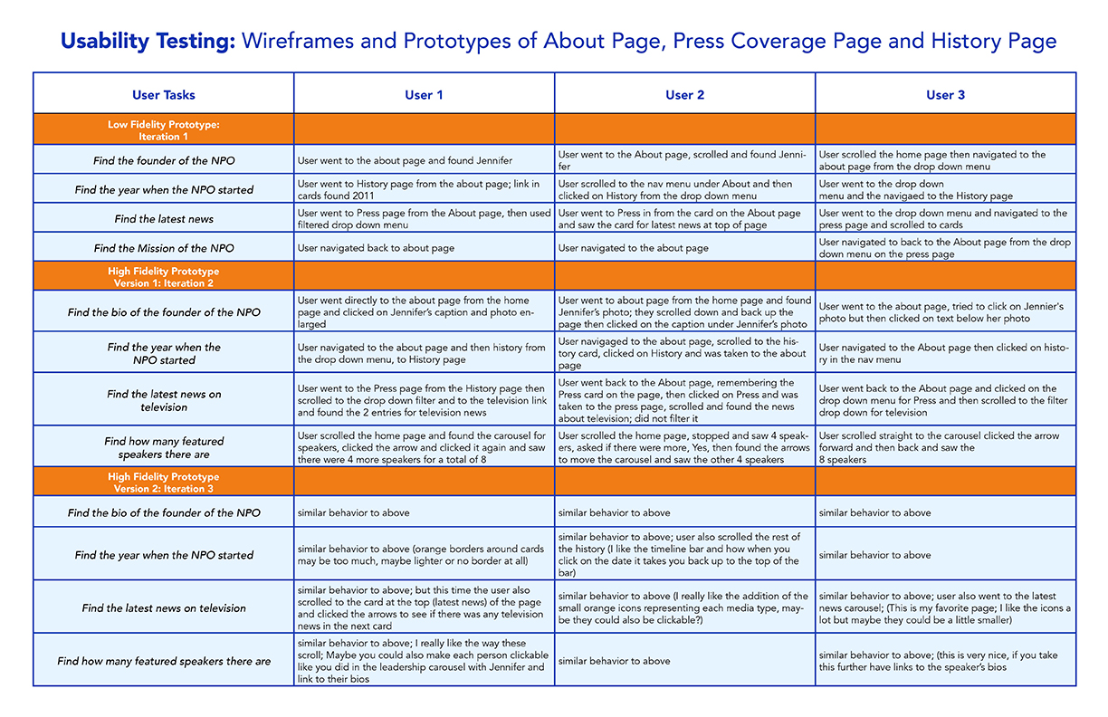
Usability testing and iterations
Site Map
consolidates menu items and, revised hierarchy
& intuitive navigation
Final Deliverables: Report & Prototype
Link to Prototype
https://projects.invisionapp.com/share/BFM6E27YDAX#/screens
Results
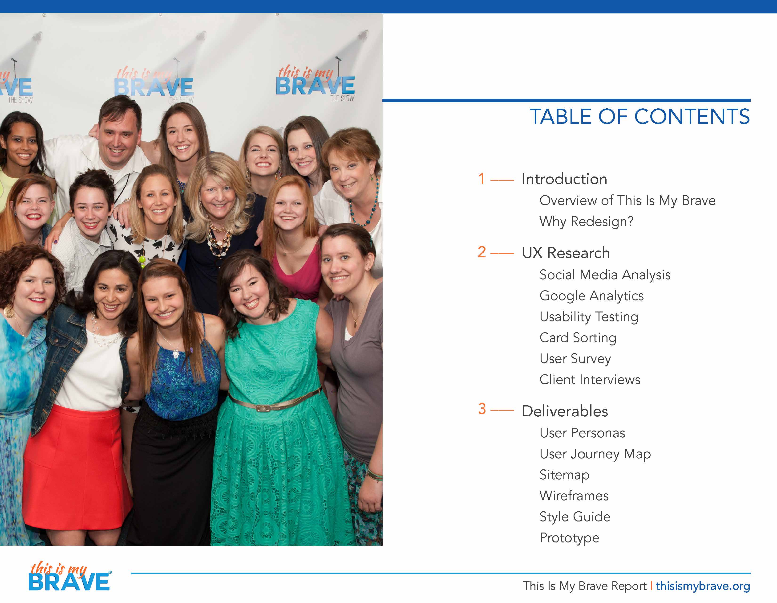
Deliverables to client were a report with documentation of the problems & opportunities, objectives and UX research. Research included social media analysis, website analysis, google analytics, card sorting, user surveys, client interviews, and usability testing,
Artifact deliverables were 2 personas, 2 journey maps, site map, style guide, low-fidelity prototype and high-fidelity prototype.
The deliverables and the report which included recommendations were delivered to the client. The client will incorporate recommendations into the final redesign of the site.


