Client
American Cancer Society
The Team
UX Analyst & UX Research; UX Research & UX/UI Design/Development; UX Lead; UX Analyst & UX/UI Design/Development
My Role: UX Analyst & UX/UI Design/Development
Problem
The team identified some major problems with the existing Prevent20 website. The website was difficult to navigate because of poor organization of information and confusing site architecture, and unclear hierarchy. CTAs on the site were confusing and not clearly defined. The client wanted to introduce new functionality which would redefine the purpose of the site. This functionality included highlighting the TAPE Team, the support network and connecting users to them. Development of content such as toolkits and resources were needed, as well as a modular system of interaction with the user. The site needed to be more accessible globally.
Objectives
- Improve Navigation
- Improve information architecture and hierarchy of information
- Implement new functionality that reflects the process of tobacco taxation implementation globally
- Implement functionality to the website that guides the user through the
process of tobacco taxation implementation and helps them with solutions throughout the process - Improve visibility, emphasis accessibility of CTAs
- Improve site accessibility and global accessibility
- Implement new content
- Highlight support network
- Implement search function
- Make website more engaging and function to facilitate partnerships
Target Personas
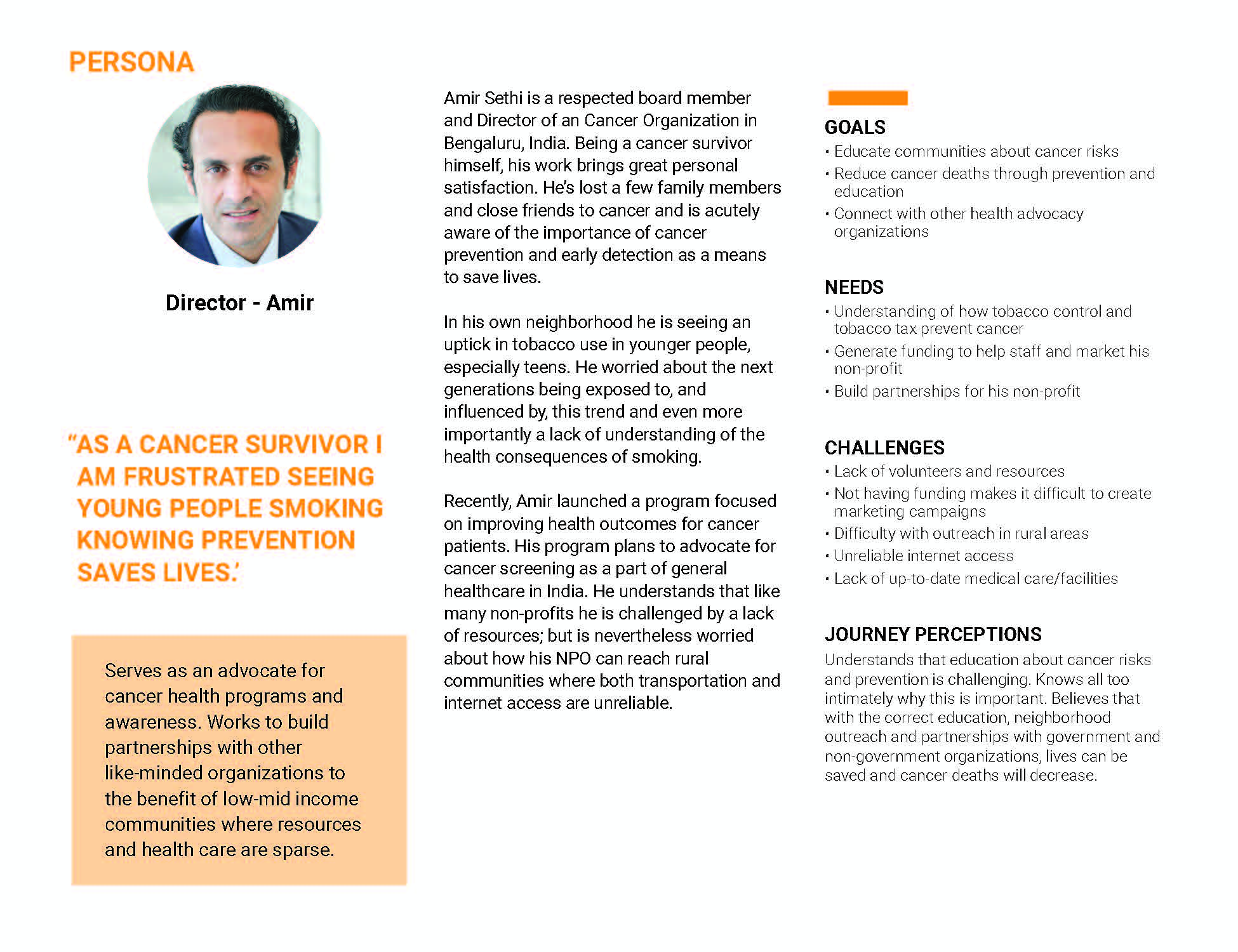
Amir Sethi is a board member and Director General of a Cancer Organization in India. He wants to prevent tobacco related cancer deaths by outreach and partnerships with government and non-government organizations. He represents a user in the pre-implementation stage of tobacco taxation.
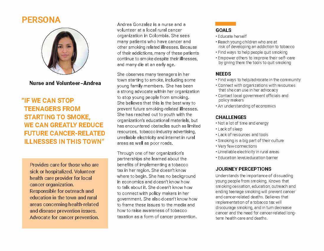
Andrea Gonzalez is a nurse and volunteer at a local rural cancer organization in Colombia. She learned about the benefits of implementing a tobacco tax in her region, but doesn’t know where to begin. She doesn’t know how to connect with policy makers. She represents the implementation stage of tobacco taxation.
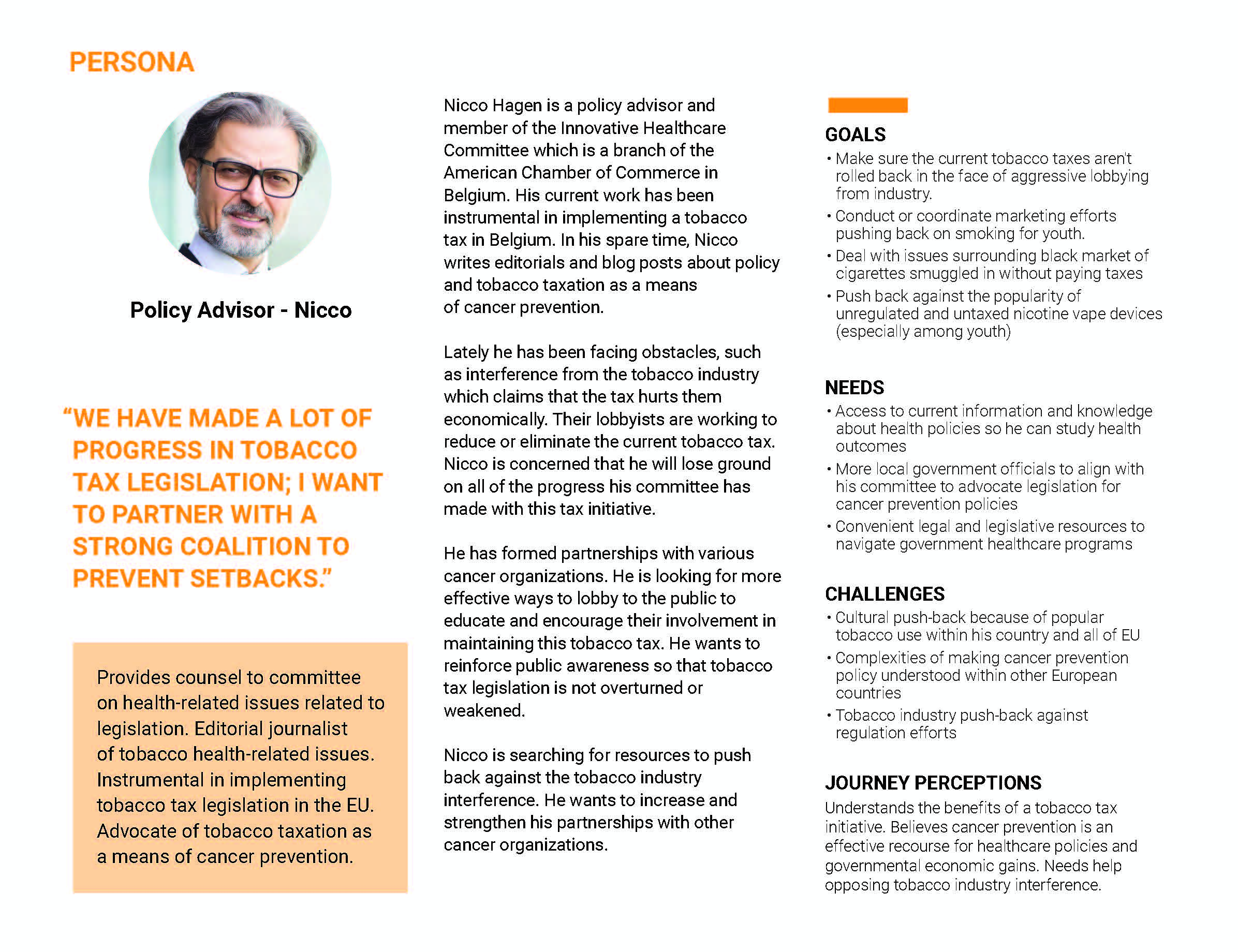
Nicco Hagen is a policy advisor and member of the Innovative Healthcare Committee, a branch of the American Chamber of Commerce in Belgium. He is searching for resources to counter interference from the tobacco industry. He is wants to find resources to help in maintaining the tobacco tax in his country and prevent tobacco tax legislation from being overturned or weakened. He represents the maintenance stage of tobacco taxation.
Project Scope
The extent of the project was to improve the user experience of the website, while introducing new functionality that will better serve users who comprise Prevent20 partners and cancer organizations, the primary users of the site. Recommendations were made based on research, data analysis, interviews, surveys, and usability testing. Site architecture was revised, hierarchy improved, accessible colors and fonts were used, and global accessibility was considered in the redesign. CTAs were better defined, made accessible and clarified. New content, resources and functionality were introduced as high level items in the site architecture. These included the TAPE team support network, fact sheets, and toolkits. These resources were designed into the site architecture so that users could easily find them.
My Contributions
My role was UX Analysis and UX/ UI design development
- Participated in analytics of quantitative and qualitative research: (i.e. interpretation of survey results, analysis and implementation of stakeholder feedback, usability testing results, etc.)
- Participated in team activities such as card sorting, persona development, user journey and user flow activities and work sessions with client.
- Drafted first digital version of user journey during works session with client
- Documented research
- Participated in usability testing
- Built current and proposed versions of site map
- Created secondary and tertiary pages of high and low-fidelity wireframes: Tobacco 101, Toolkits (Take Action), and Tobacco Tax Tookit (Dig Deeper) pages
- Created low-fidelity and high-fidelity prototype
- Created secondary and tertiary pages of high-fidelity wireframes: Tobacco Tax 101, Take Action, and pages and iterations of versions
- Persona development: created persona of Andrea a user of the implementation stage of the tobacco taxation process
- Participated in renaming CTAs and navigation menu items
Came up with the format for the toolkits and suggested nomenclature of each toolkit as a “Solution” to a question from a user
UX Research
Qualitative
- Meetings and Video Conferences with Stakeholders
- Heuristic Analysis
- Competitive Analysis of websites
- Observations
Quantitative
- Survey of coalition partners and friends
- Hotjar analytics
Information Architecture
- Team card sorting and content
- Create Current site map
- Site Map version 1: revised after 2nd team card sorting
- Site Map version 2: revised after client meeting
- User Journey
- User Flow
- Site Map version 3
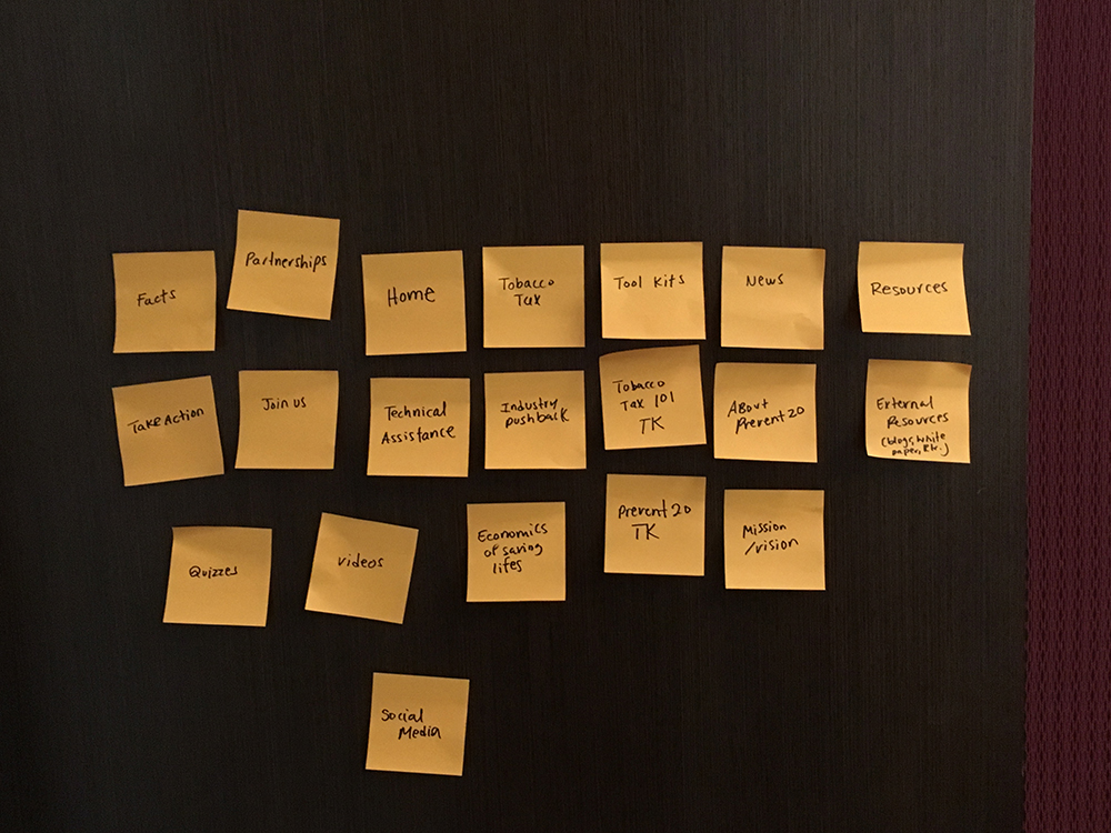
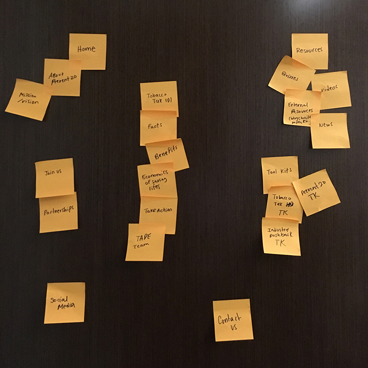
Team Card Sorting
Site Maps
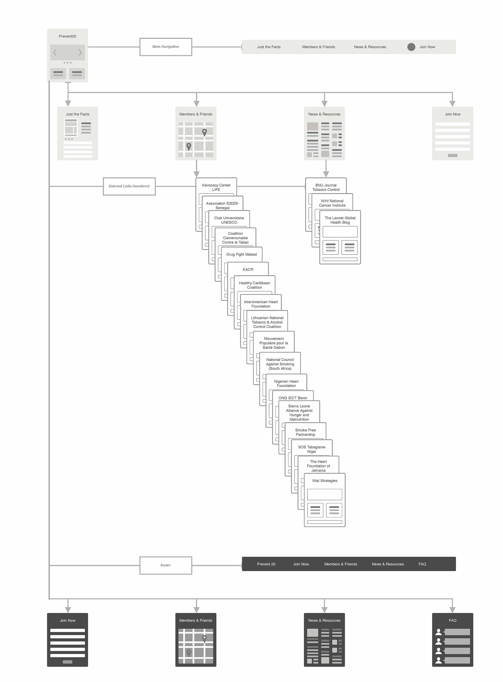
A site map of the current site was created. Problems with the site architecture were observed. The CTAs in the site were buried, the mission and vision were not clear and it was difficult to find the meaning of Prevent20. Some CTAs were redundant and not well defined. Content hierarchy was not clear and secondary pages had links to fact sheets, external resources and sites. There was not sufficient labeling and categorization of information on the secondary pages, and limited content, which made searching resources difficult.
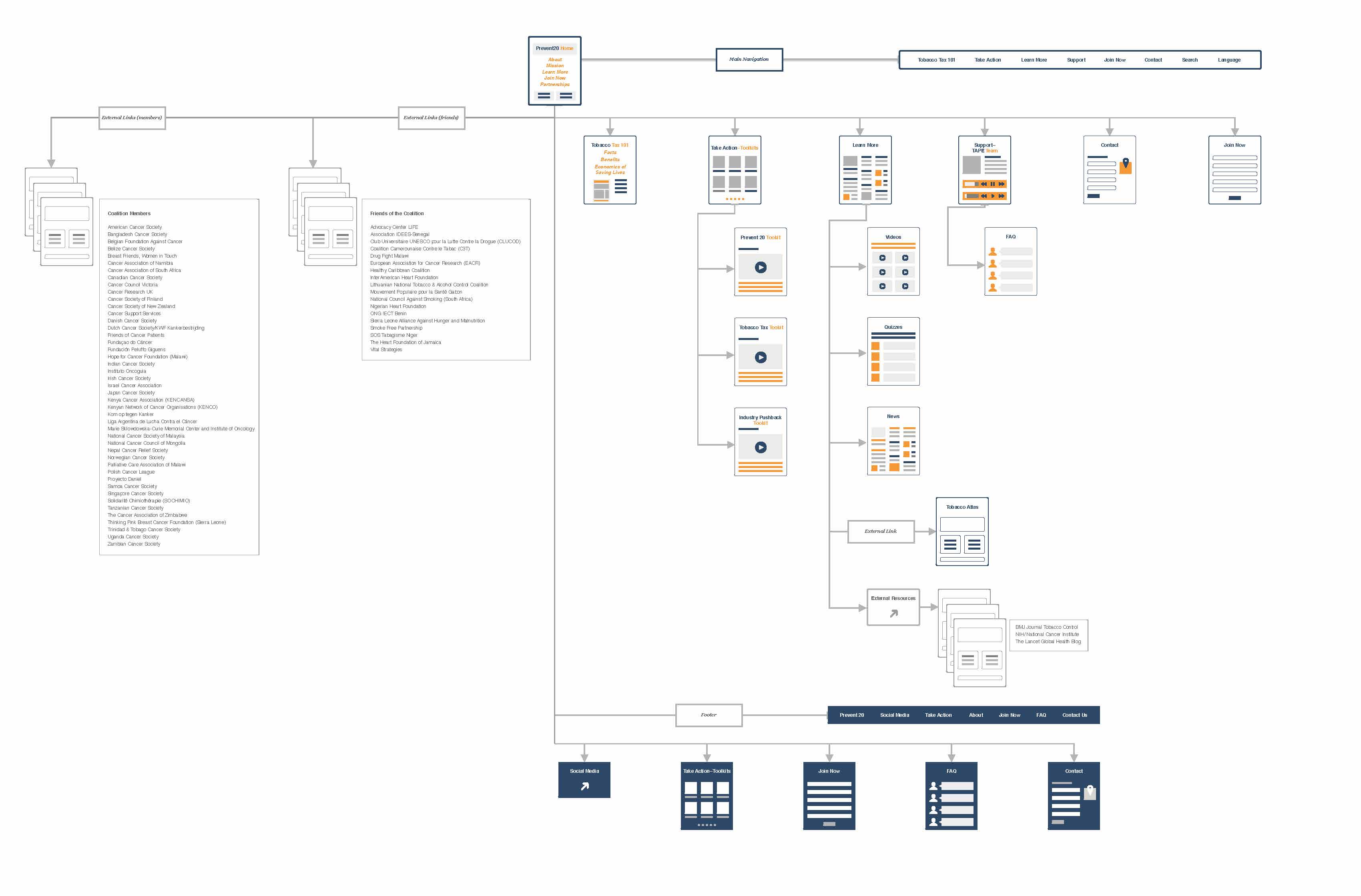
After several iterations of team card sorting, a site map was drafted. CTAs, the mission, vision and coalition and partner organizations were integrated on the home page. New functionality and modular resources called toolkits were introduced. This content resides on a secondary page called Take Action, and a corresponding menu item was added. Below the Take Action page, there are tertiary pages for each of the toolkits. Each toolkit corresponds with a stage in the tobacco taxation process, pre-implementation, implementation and maintenance.
The Learn menu item replaced News and Resources with a corresponding secondary page containing external resources and fact sheets. Three tertiary pages, Videos, Quizzes and News are below the Learn menu.
Tobacco Tax 101 is a navigation menu item and page with general information about the benefits of the tobacco tax.
A new main navigation menu item and secondary page were added for new content, the Tape Team, the organization’s technical assistance team which provides support to the user in the tobacco tax implementation process. The menu item for the Tape Team was renamed Support. Below this page will be an FAQ page.
Site Map Current Site
Proposed New Site Map
User Journey
A user journey was mapped during a work session with the client. It is based on a fictitious user Rasmane Zinaba who is the director of a Health Organization in Burkinafaso. The journey takes him through all of the stages of the tobacco tax implementation process. Highs and low feelings are mapped and opportunities for growth are identified (i.e. clearer emphasis on CTAs and fundamentals of tobacco taxation, highlighting the TAPE team, making the toolkits and resources more accessible, and restructuring the navigation).
Draft: Working Session
User Flow
A user flow was developed for this process and mapped to show user interaction with Prevent 20 resources and proposed website functionality, which coincided with the path and events of the user journey. From this user flow, distinct steps in the process were identified and insights into navigation of the proposed website and its tools were gained.
Journey Map Final with User Flow
Style Guide
A style guide was developed for the website. Accessibility was considered as well as cohesive, functional and appropriate UI. Standards for layout of the home page, secondary pages and tertiary pages were defined. Header, footer and buttons and forms were standardized. The style guide standards were then applied to the high fidelity wireframes and prototype.
Usability Testing and Analysis
Low-fidelity wireframes and prototype
- Usability test of low-fidelity prototype
- Stakeholder feedback of low-fidelity prototype
- Iterate on low-fidelity prototype
Link to Low-Fidelity Prototype
High-fidelity wireframes
- Feedback from stakeholders
High-fidelity prototype Version 1
- Usability testing of high-fidelity prototype
- Iterate on high-fidelity prototype
High-fidelity prototype Version 1a
- Usability testing of high-fidelity prototype
- Iterate on high-fidelity prototype
High-fidelity prototype Version 1b
- Testing by instructor
- Evaluation and feedback from instructor
Final Deliverables: Report and Prototype
All of the CTAs were moved to the home pages as well as the partnerships. The CTAs include Join Now, Sign up for Our Newsletter, Follow the Coalition on Social Media and Take Action. From the home page are direct links to the toolkits page, renamed Take Action, via a Take Action CTA or Take Action menu item.
The Take Action page was designed as a road map, which was named The Roadmap to Success, each step along the road representing a stage in the tobacco implementation process. There are three stages in the process, Get Started (the pre-implementation stage), Dig Deeper (the implementation stage) and Keep Advancing (the maintenance stage). From the roadmap, the user can navigate to the various toolkits, either by using the buttons on the roadmap or from the drop-down navigation menu. The various toolkits were renamed solutions, with typical user questions prompting specific solutions. The roadmap leads to modular toolkits, that include the Prevent20 Toolkit, Tobacco Tax Toolkit and Industry Pushback Toolkit; there are placeholder on the page for additional toolkits, allowing for growth. Each toolkit will be available for download and sharing; and each will have its own corresponding web page to which the user can navigate.
Tobacco Tax 101 is a menu item with corresponding page that includes introductions and facts about tobacco taxation, explanation of the process and the “Economics of Saving Lives”. There are buttons to download fact sheets and as well as a form to download a fact sheet specific to a country.
The Learn menu item with corresponding secondary page, is proposed to have a drop-down menu with Videos, Quizzes and News leading to corresponding pages.
The Support menu item with corresponding secondary page, is proposed to provide information about, and a way to contact the TAPE Team, 24/7. There will be a drop down menu to a tertiary FAQ page.
The Contact menu item and corresponding page will be a general contact form, not associated with the TAPE Team.
The Join Now menu item with corresponding page lead to a Join Now form, that can be accessed directly from the navigation menu.
There will also be a Search bar and Language drop-down menu on the main navigation menu.
The Prevent 20 logo leads to the home page.
The footer includes some redundant menu items and CTAs.
Link to High Fidelity Prototype Version 2
Results
All of the team’s objectives were achieved through a process of research, user testing, iteration and stakeholder reviews.
- The site architecture and navigation were greatly improved by developing a strong hierarchy, emphasizing CTAs, and developing a user flow through insights made from a journey map.
- New required functionality redefined the main purpose of the site. It would evolve from an informational site to a site user-centered site focused on achieving the goal of implementing tobacco tax globally. The user, members of cancer organizations will be able to use the site, focus on their goal, find resources that are specific to specific stages in their journey of tobacco tax implementation, and have resources that can give them immediate assistance if they have any roadblocks in the process.
- The objective of emphasizing CTAs with more visibility was achieved by moving them to the home page, clarifying their purpose, renaming them to avoid ambiguity and making them accessible throughout the site.
- Improving overall site accessibility was achieved by creating a site map that eliminated buried CTAs and content, and organized content through a strong hierarchy. Accessibility was also improved by using an accessible color scheme development in a style guide.
- Global accessibility was improved by introducing a language option, search function and an alphabetical organized system of providing access to the user of friends and members, with the ability to grow. This supports the objective of making the website more engaging and functional, facilitating partnerships.
- New functionality of toolkits was included in an organized step-down intuitive manner, where the user could follow a “road map” to pertinent questions and ultimately solutions.
- The support network of the TAPE Team was highlighted at a high level, and made accessible to the user.
Final Presentation and UX Recommendations